Arktos
Science finds truth in the natural, physical world. Art finds truth in the emotional, metaphysical world. They entwine with Arktos, a bioscience startup that’s truly changing the world with their understanding and technology around protein production in DNA and RNA.
Life finds a way
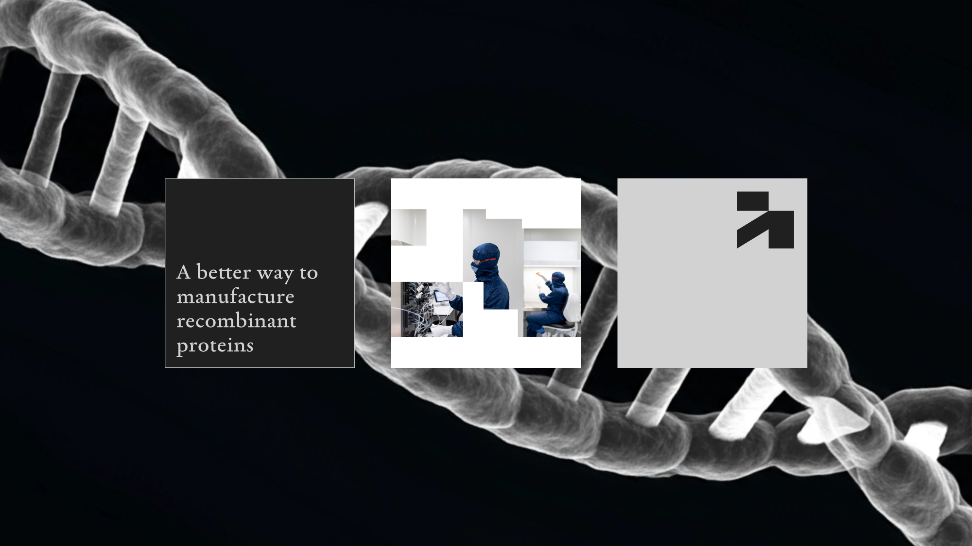
It all comes back to the double helix. Arktos doesn’t exist without it. The mark and extended identity are all built on the form and construction of DNA.
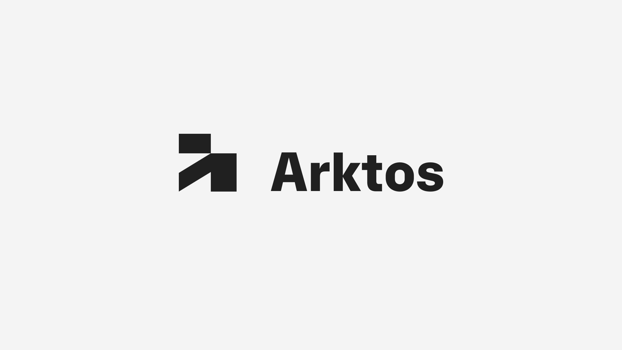
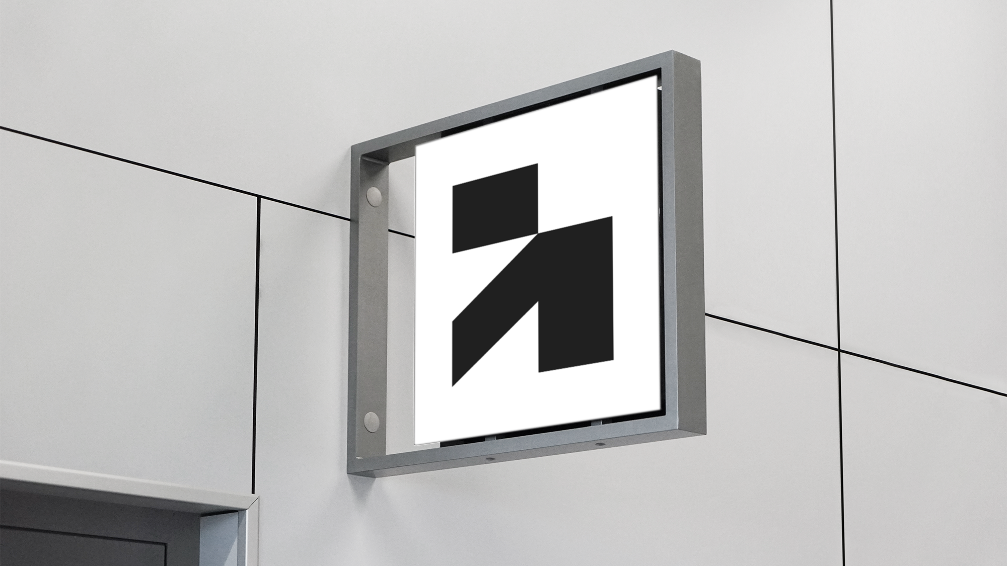
The brand mark is more than just a lowercase “a” monogram. The x- and y-axis on emphasize the diagonal line: a metaphor for the heat maps of DNA. The unique mark also opened a Pandora’s box of possibilities with shape layout.
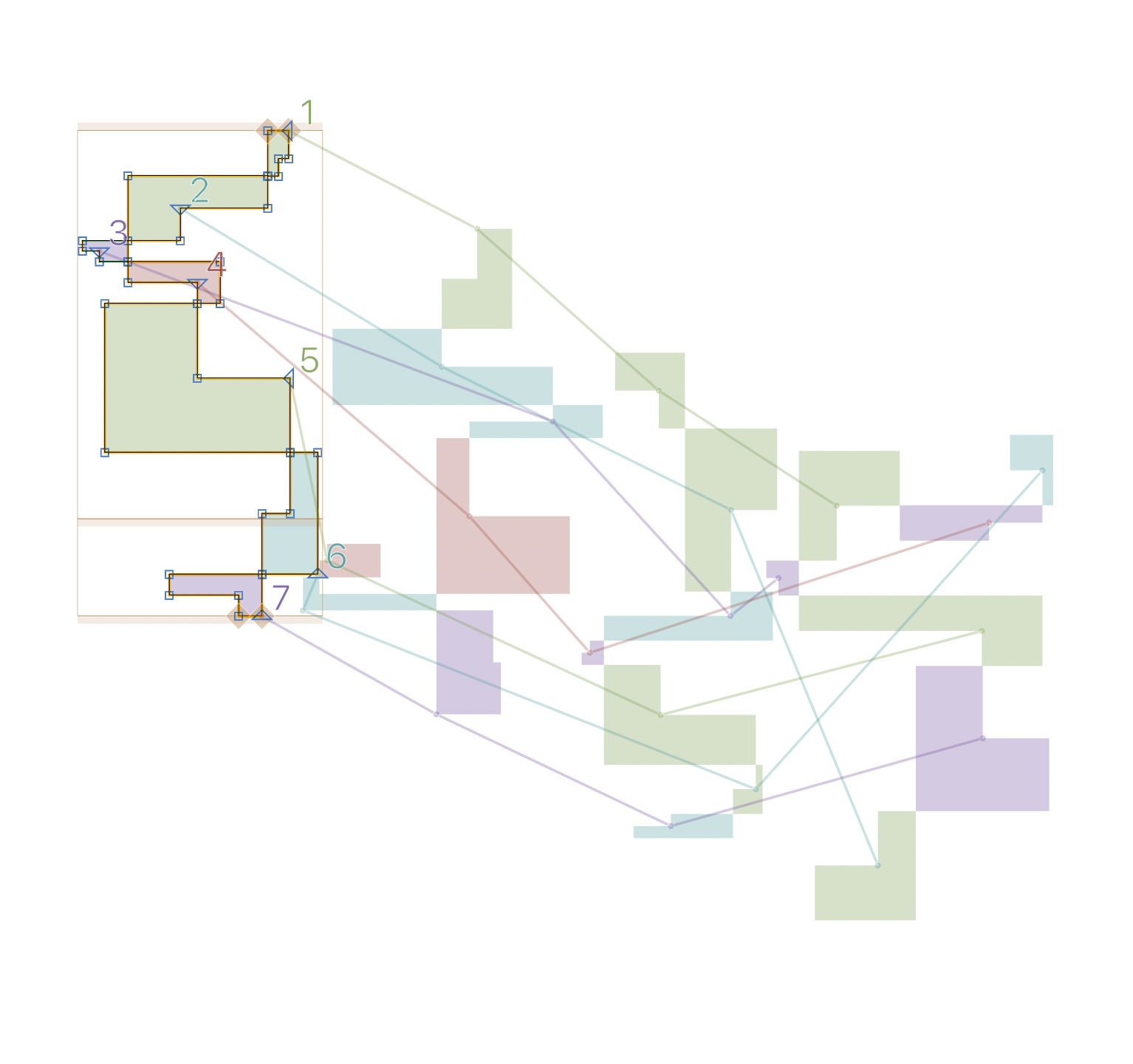
I developed a variable font whose glyphs could shift and edit, just like DNA itself.
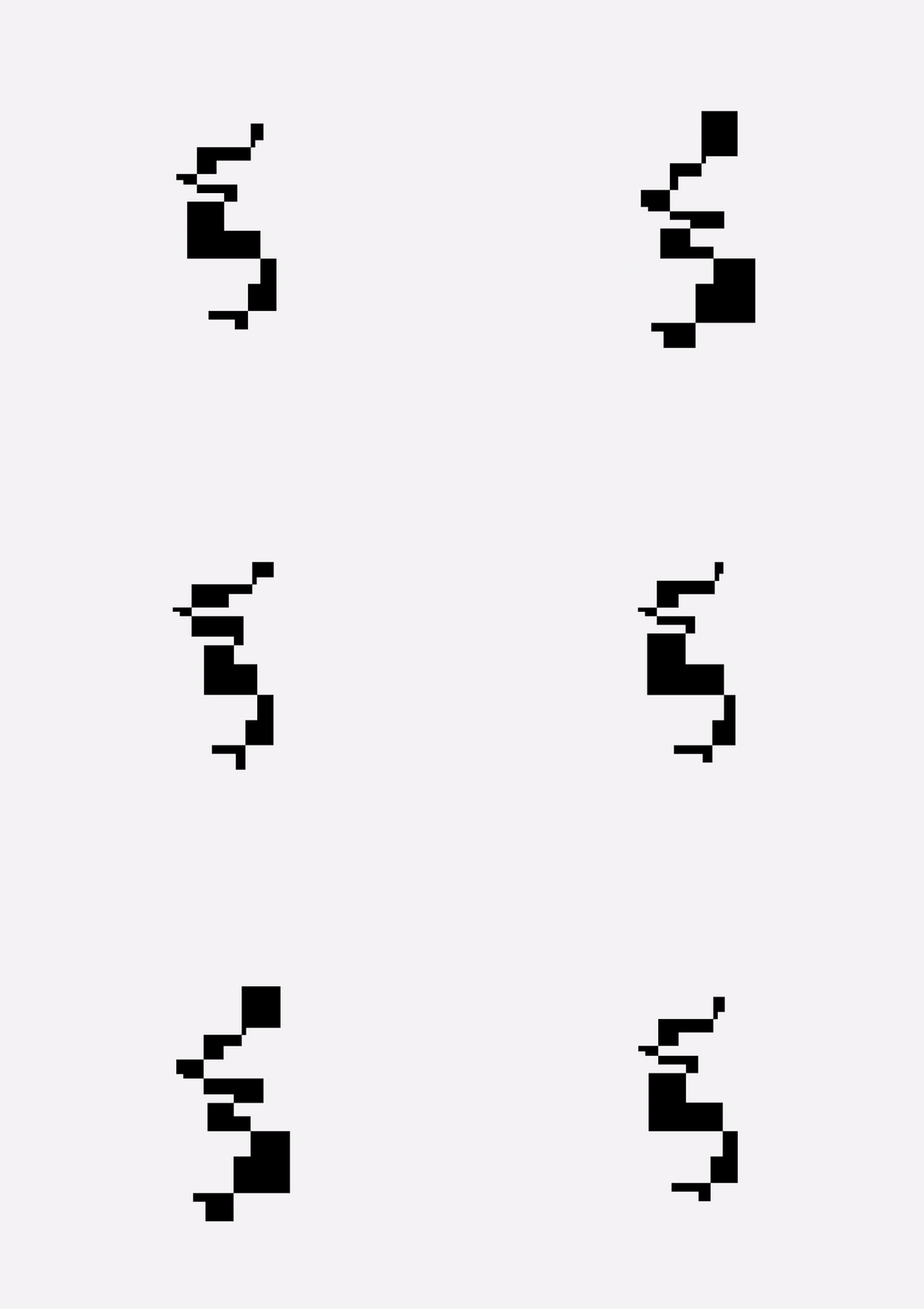
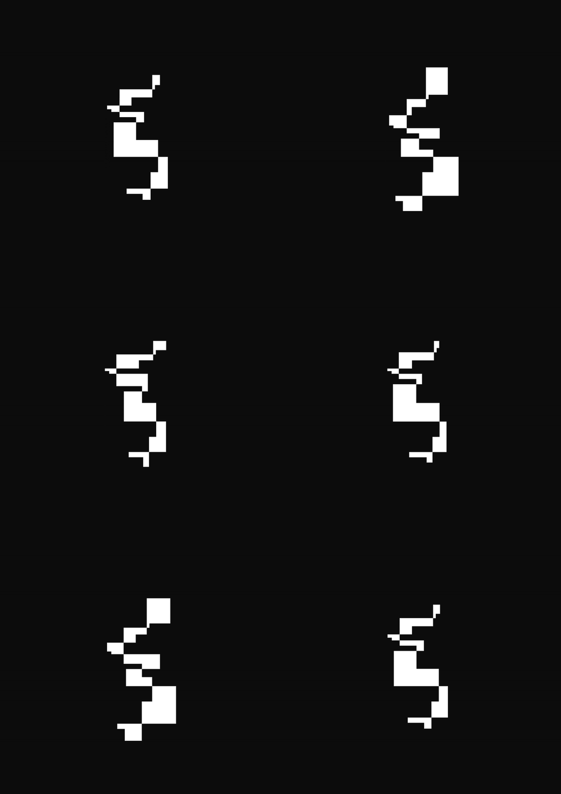
These still frames combine to clip and mask macro and micro imagery.
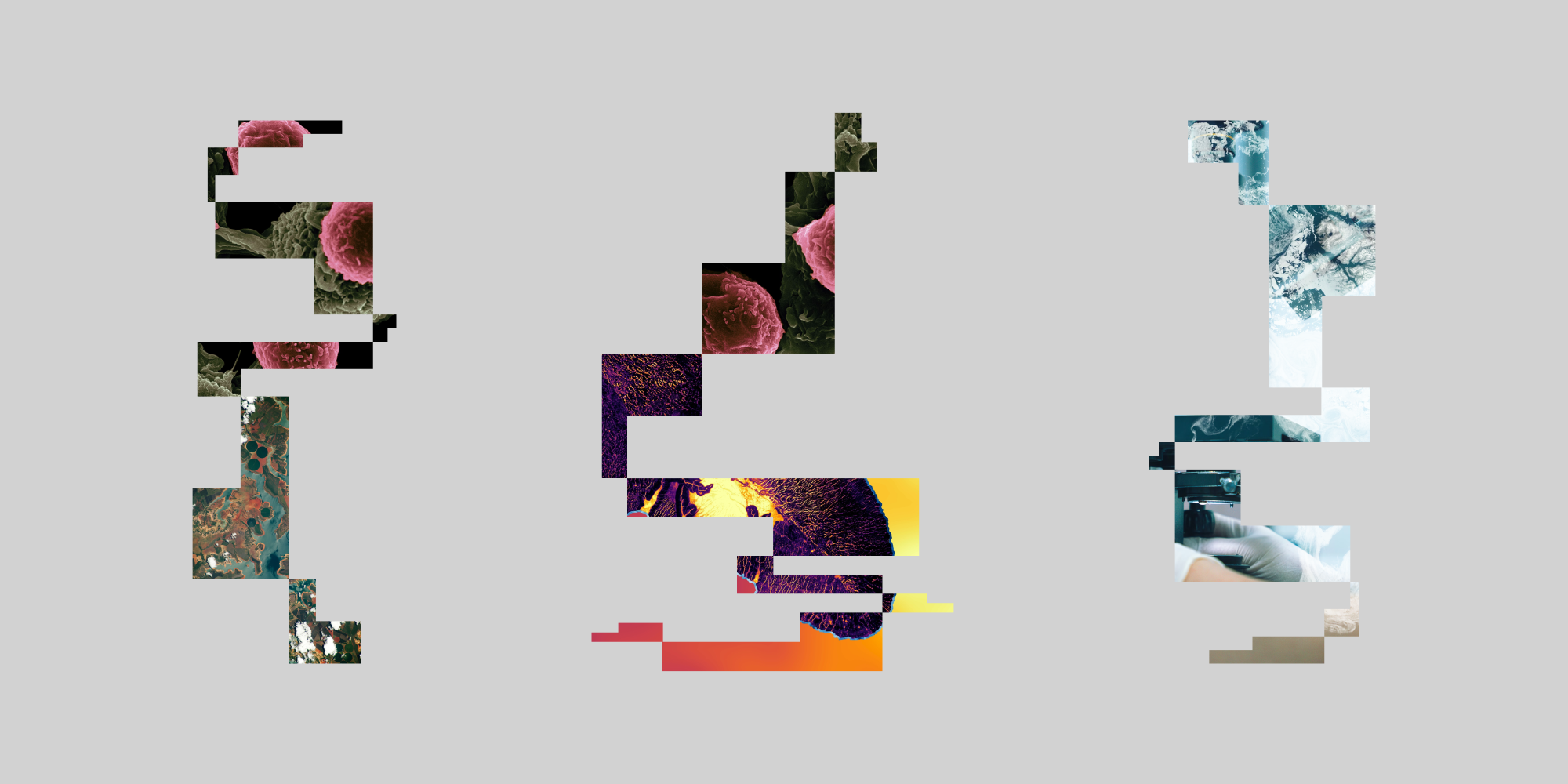
Aerial photography and microscopic imagery is paired together to continue the narrative of Arktos’ core mission: global impact at a microscopic scale.
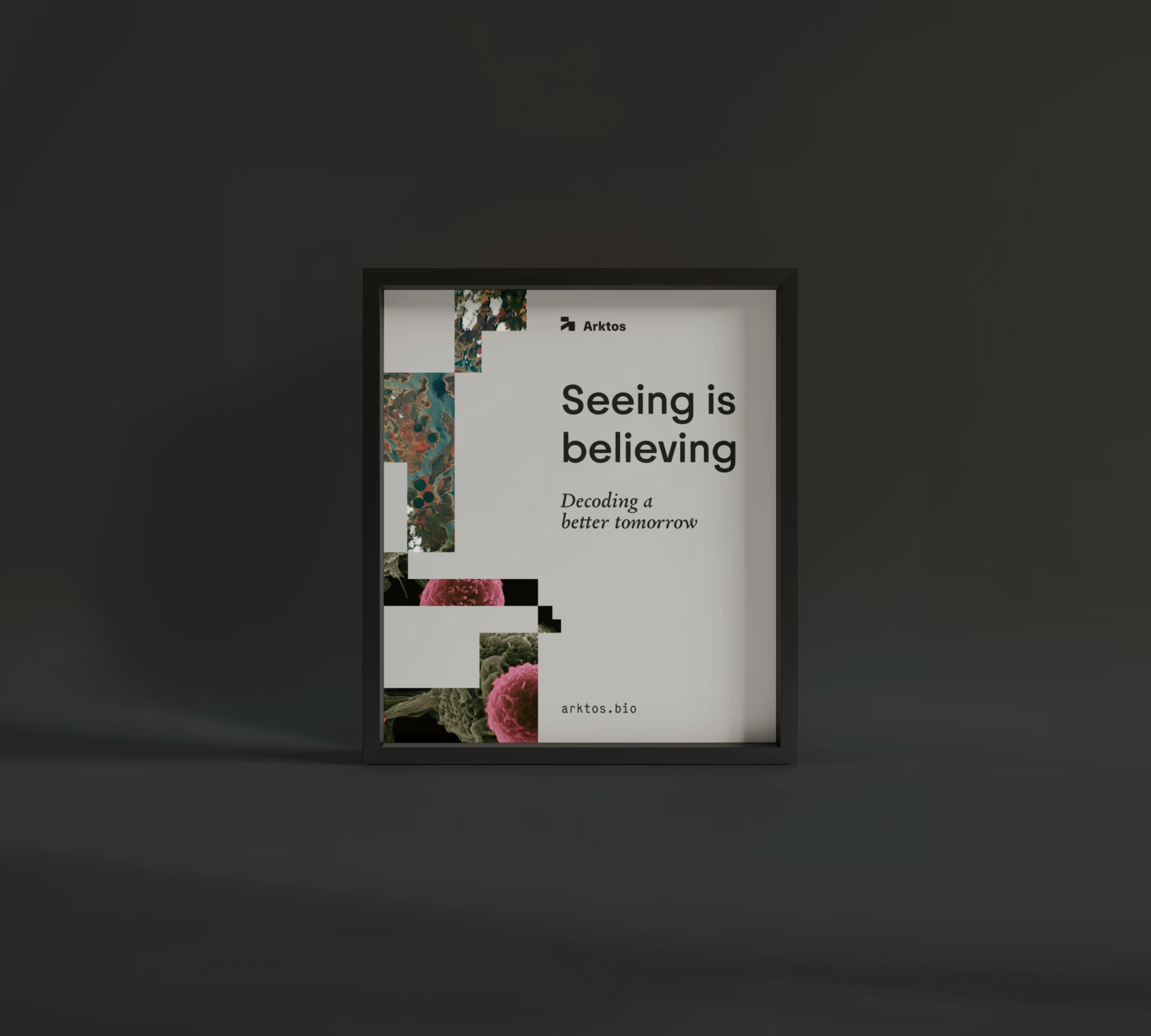
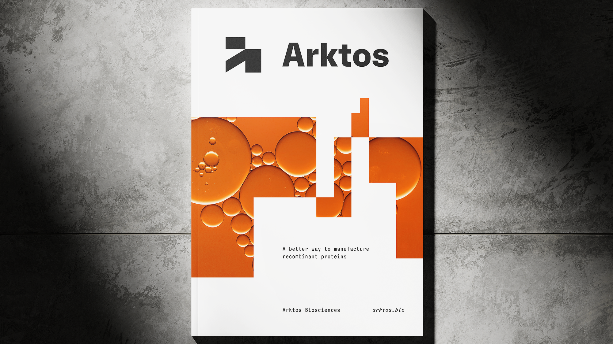
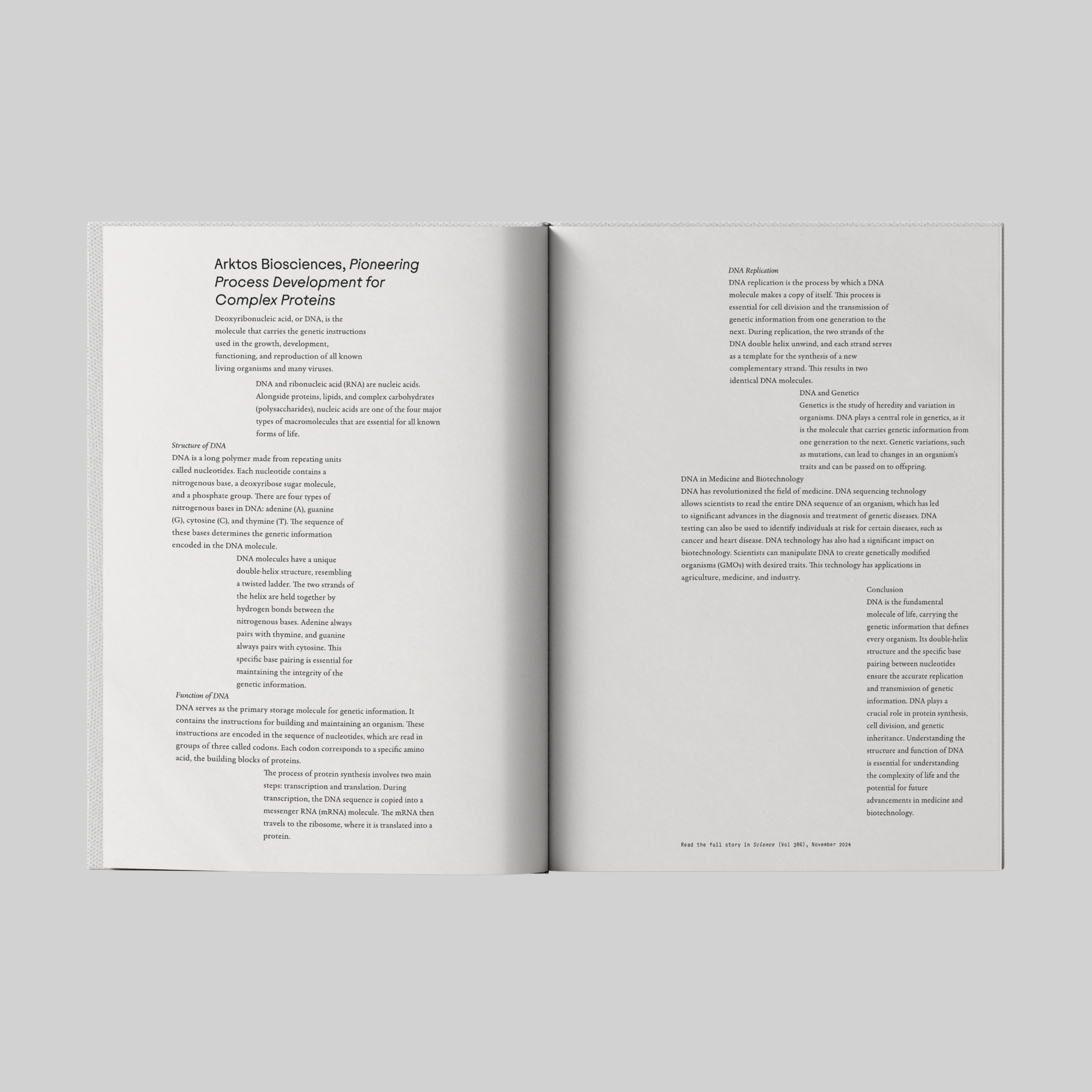
Typography is what really sings in the Arktos system. We employ three unique font families. Juneau is the sans serif headline. The geometry and simplicity are clear and excellent. Body copy is Garalda, a reinvented Garamond. And finally, Elma Mono is for supporting text and bylines — common in the world of science and attribution layout.
These three disparate families come together to create a true typographic texture and identity for Arktos to embody their vision of change.
This project was completed with Joshua Blankenship at Warm.
See more at arktos.bio.