LaunchDarkly
In 2019, I reached out to LaunchDarkly for an open Senior Brand Designer role. Ghosted. No one ever replied to my email. Just a year later, in 2020, I was at Focus Lab when a client rolled into the qualified leads funnel. It was LaunchDarkly needing an end-to-end rebrand. Enter: me.
LaunchDarkly was such a great partner. Keith Messik, SVP Marketing, and Dustin Haver, Head of Design, were fantastic partners in bringing the new identity to life.
We wanted brand attributes beyond “Modern, Approachable, and Trusted.”
On the strategy phase.
A reliable maverick.
The theme of space was irrefutable from the beginning. But making it different was a deep process of strategy that reveled LaunchDarkly as the Reliable Maverick, assured, bright, and boast-worthy. It was much easier to uncover the visual identity with such a unique brand story.
Halftone, outer space, and exploration.
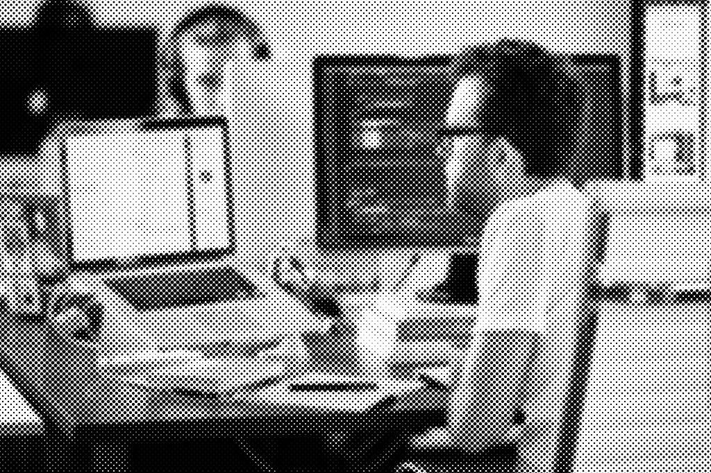
The visual language grew from a place of outer space — grayscale, with occasional blips of color. Photography was halftoned to amplify a brand rooted in futurism, while allowing other elements to balance a tempered nostalgia.
We used halftone patterns, open-source imagery of planets and stars, and primary shapes set in unique brand colors to establish an iconic visual ecosystem.
Typography
What a joy to pair Audimat 3000 (by Jack Usine) with Söhne (by Klim Type). Their partnership plays an essential part of the identity. It lets LaunchDarkly be boast-worthy while remaining reliable and assured.
Audimat 3000 carries a subtle blend of rigidity and eccentricity. Söhne is more no-nonsense — its DNA in Akzidenz-Grotesk — making it a suitable option for longer-form text where Audimat catches the eye.
See it live: launchdarkly.com.